
I did so many different copies of the logo with different font, different kerning and different leading. Here are the example below:


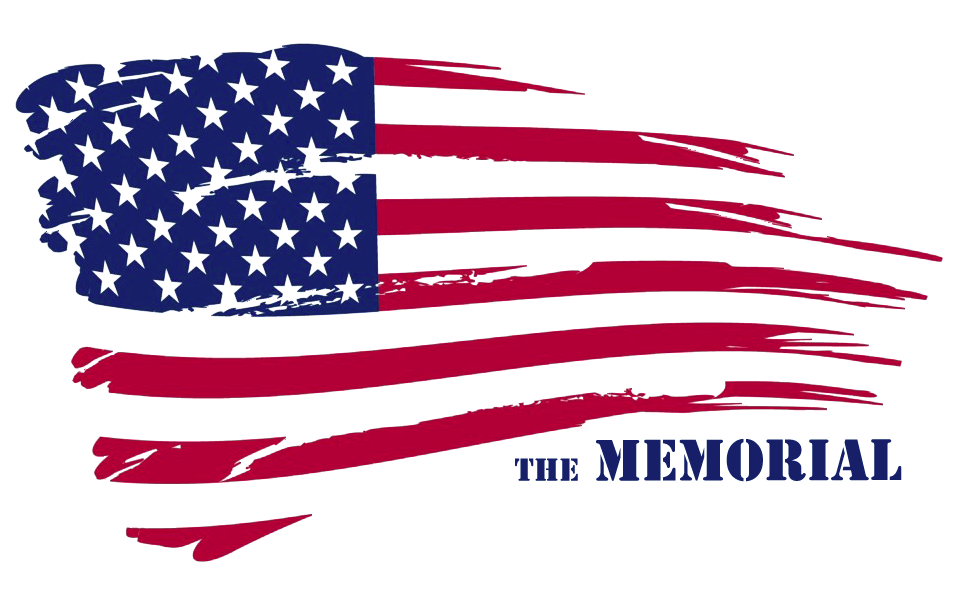


Then after talking with the tutor and listening to his advice i narrowed it down to one and chose to do the logo i have below. Using Times New Roman, a basic font but with the contrast of the flat they work very well together. After looking at previous logo's in America i think this could work because it users there precious flag, national colours and something very big in America's history. Give off more than one feeling just from the logo.

No comments:
Post a Comment